TLC Dental approached us to create their first website, aiming to establish an online presence, attract new patients and support digital marketing initiatives. Their goals were to present their services clearly, make booking appointments simple and reflect a professional trustworthy brand.
Role: UX/UI Designer
Team: Dimitri (Client), Brendon (Account Manger), Derik (Developer), Raynal (SEO Analyst)
Since TLC Dental had no existing website, patients had no central place to learn about services, book appointments or engage with the clinic online. The client wanted a modern, trustworthy design that could position them as a credible dental provider while being simple enough for patients of all ages to use. Beyond just creating an attractive interface, the site needed to provide a seamless booking flow, clear navigation and the flexibility to scale with future SEO and marketing efforts.
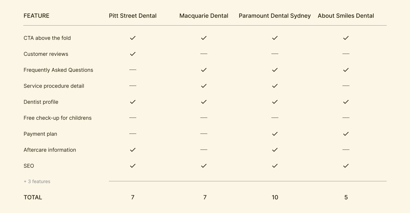
I began by leading research sessions with the stakeholder. Working with the Account Manager, we interviewed the client to understand their priorities and business objectives. In parallel, I conducted short surveys and conversations with patients to uncover common frustrations when booking dental services online. Insights revealed that users wanted a straightforward booking process, quick access to service details, and a design that inspired trust. To inform best practices, I also performed a competitive analysis of other dental websites, identifying what worked well and where opportunities existed to differentiate TLC Dental’s digital presence.
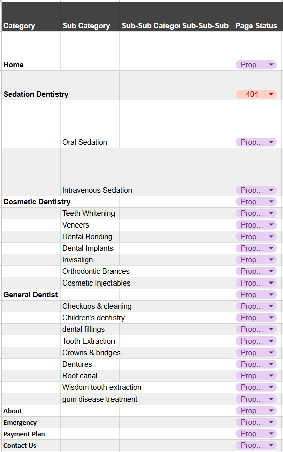
With these insights, we were able to define user flows around two core actions: learning about services and booking an appointment. I collaborated with the Account Manager to validate that the structure aligned with business goals and with the developer to confirm technical feasibility. This foundation ensured that the content hierarchy was intuitive and that key calls-to-action like booking an appointment, were always within reach.
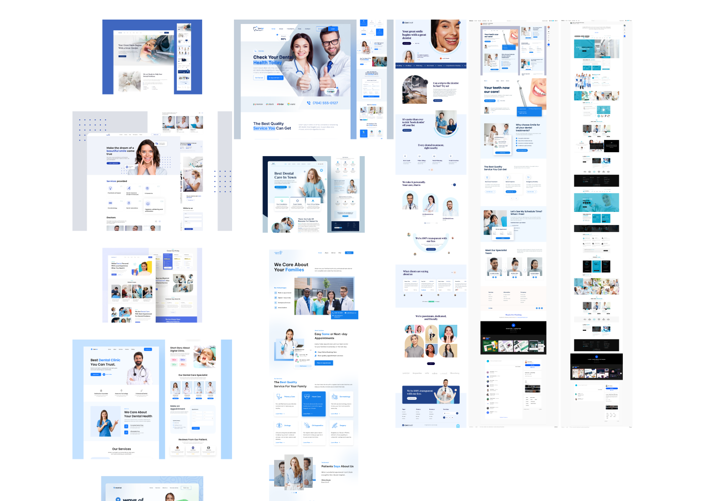
Moodboard
Once the site structure was in place, I shifted focus to defining the visual direction. To capture the right tone, I created a moodboard that explored colour palettes, typography and imagery styles aligned with TLC Dental’s brand values. The goal was to balance professionalism with approachability designs that would instill trust while remaining warm and welcoming.
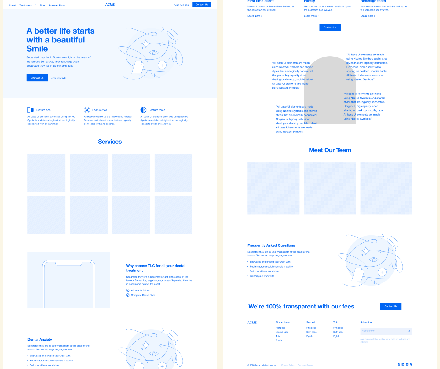
Wireframes
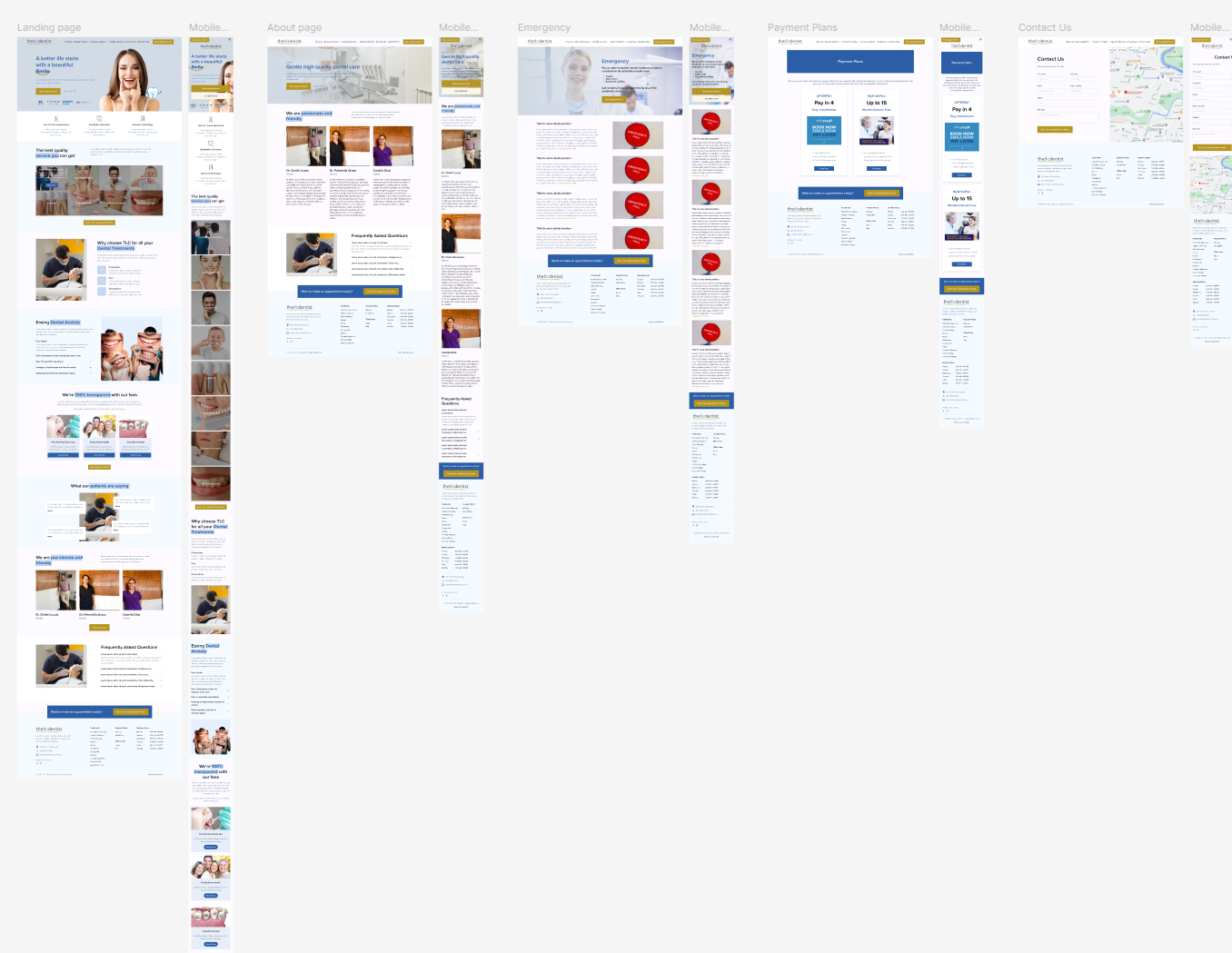
Next, I moved into wireframing, creating low-fidelity layouts. The focus here was on navigation, hierarchy and usability rather than visual design. These wireframes were shared with the client and the project team for feedback, which helped refine content placement and clarify the booking flow before moving into the final design phase.
Visual Designs
After aligning on the moodboard, I translated the chosen visual direction into high-fidelity wireframes. These incorporated the approved colour palette, typography and imagery style showing how the brand identity would come to life across layouts. The wireframes detailed content hierarchy, spacing and interactions while keeping the focus on usability and clarity of the booking flow.
From there, I refined the wireframes into visual designs that balanced professionalism with approachability. By applying the moodboard elements consistently across pages and components, the final design felt cohesive and trustworthy, giving TLC Dental a polished online presence that resonated with their patients while supporting their business goals.
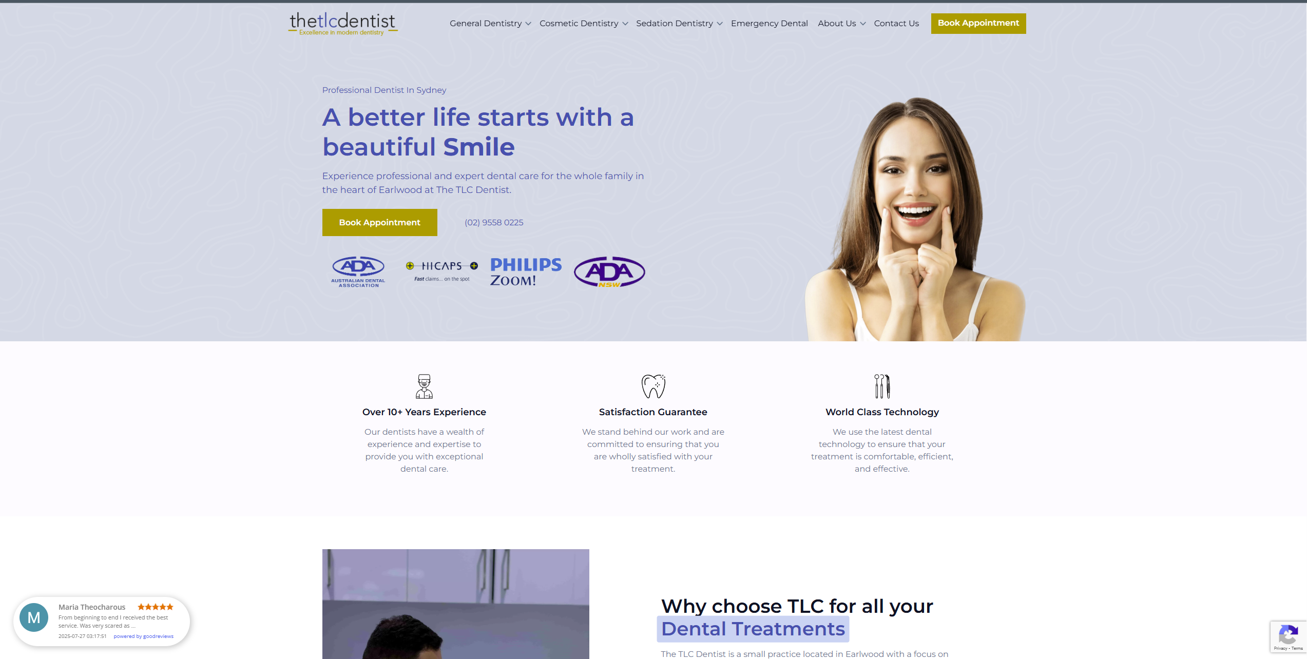
The result was TLC Dental’s very first website: a modern, responsive platform that clearly communicates their services, simplifies the appointment booking process and reflects their professionalism. The website not only established their online presence but also positioned them for future growth through SEO and digital marketing integration. Both the client and patients responded positively, praising the design for its clarity, usability, and approachable aesthetic.
This project was a valuable reminder of the power of collaboration in UX/UI design. By working closely with the client, Account Manager and developer. We delivered a solution that balanced user needs with business goals and technical requirements. Most importantly the website provided TLC Dental with a digital foundation to grow their practice and build trust with new patients.